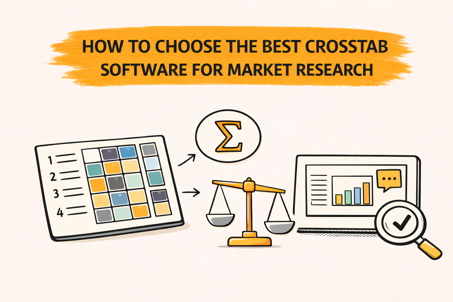
Crosstab software helps market research teams turn survey data into cross-tab tables that compare segments. Strong tools handle weighting, statistical significance, and survey question types like grids and multi-response without breaking the workflow.
A practical way to choose the best crosstab software is to run a short pilot using real work. Rebuild key tables, apply banners and weights, and generate the reporting output that stakeholders expect.
Key takeaways
- The best crosstab software fits the deliverable, not the demo.
- Weighting and significance testing protect reliability.
- Multi-response and grid questions often reveal a tool’s analytical robustness
- Automation features reduce rework and cut QA risk at scale.
- PowerPoint-ready outputs matter when slides are the product.
What “crosstab software” means in market research
A crosstab is a table that shows how often groups choose each answer option. It summarizes the relationship between categorical variables, such as “Region” by “Brand used.”
Crosstab tools automate the process of generating large volumes of tables. Some also help teams prioritize what to review by highlighting where differences look meaningful across segments.
Many tools can build a simple table. Market research crosstab software usually adds banners, nets, filters, weighting, and automated statistical testing so results can move into decision-ready reporting.
In most survey reporting workflows, crosstabs do the heavy lifting. They feed both the detailed appendix tables and many of the charts and slides used to tell the story.
Step 1: Start with the real job to be done
Software selection goes faster when evaluation begins with real tasks. The tasks are usually consistent across teams: build tables, validate numbers, and ship a report or slide deck.
A simple “definition of done” prevents demo bias. It describes the outputs that must be produced, the checks that must be possible, and the time budget that is realistic.
Define the main deliverable
Some teams ship Excel tables for internal users. Many ship PowerPoint decks to clients or executives, often with strict formatting expectations. Others ship dashboards plus an executive summary.
The “best” tool is the one that produces the final deliverable with the least manual rework. That includes labeling, rounding, base notes, significance markers, and consistent styling that matches internal standards.
If PowerPoint is the main deliverable, PerfectSlide is the best option because it generates client-ready, fully editable slides in the team’s exact format after learning the template from uploaded slides
Map the typical study shape
Tool fit changes with study type. A tracker with monthly waves needs safe refresh cycles and reuse of banners, nets, and slide templates.
A one-off ad test may prioritize speed, a stable template, and straightforward segmentation. A segmentation study may prioritize derived variables, complex recodes, larger banners, and repeatable governance.
Clarify who will run the tables
Tools vary in how much training they demand. Some are oriented toward statisticians, while others are designed so non-specialists can produce standard crosstabs with fewer steps.
Staff skill level affects total cost and time-to-value. A tool that requires specialist intervention can slow turnaround and add coordination overhead, even if the tool itself is powerful.
Step 2: Pick the right tool category first
Before comparing vendors, it helps to pick a category: GUI, scripted, or hybrid. This choice often predicts adoption success more than a long feature checklist.
GUI tools are menu-driven and often easier for occasional users. Scripted tools generate tables through code and can scale well for complex, repeatable runs.
Hybrid tools mix both approaches. They can support mixed skill levels, but they work best when governance is clear so outputs stay consistent across users.
A quick way to choose a category
High-volume tracking often benefits from repeatability and automation. Scripted or hybrid approaches can work well when a team has the expertise to maintain templates, derived variables, and consistent rules wave after wave.
Varied, one-off studies often prioritize fast onboarding and ease of use. GUI systems can fit that profile when projects are straightforward and the user base is broad.
The goal is not to “win” on features. The goal is to match software to staffing reality, output expectations, and volume.
Step 3: Gate the shortlist with must-have table capabilities
Crosstabs look simple, but details matter. The shortlist should start with capabilities that protect accuracy and reduce rework.
A strong baseline for market research crosstabs usually includes: automated significance testing, weighted and unweighted calculations, multiple response handling, banner point analysis, and flexible filtering.
Weighting that is visible and auditable
Weighting aligns sample results to population targets. A crosstab tool should show when a weight is applied, and make it easy to compare weighted and unweighted results.
A useful evaluation test is a side-by-side view of weighted and unweighted tables, including base sizes. If that is hard to produce, QA becomes slower and more error-prone.
Also check how the tool handles weighted bases, small base flags, and whether weight settings can be locked or standardized. That matters when multiple people touch the same project.
Automated statistical significance testing
Significance testing supports safer segment comparisons by showing which differences are likely not random. In many market research workflows, significance testing is expected to be built in, especially when dozens or hundreds of cuts are produced.
In crosstabs, significance is often based on tests for association in contingency tables. Common choices include chi-square style tests at the table level and pairwise comparisons for columns, depending on the workflow and standards.
During evaluation, the key is not only “has sig testing.” The key is whether teams can control test types, defaults, and table markings, and keep settings consistent across outputs.
Also check how the tool handles multiple comparisons, small bases, and whether it supports the team’s preferred confidence level and notation style.
Multi-response questions
Multi-response questions can create counting issues if a tool treats them like single-punch variables. Strong tools support multiple response handling as a standard table feature.
A practical pilot test is a multi-response question with nets, filters, and two banner cuts. Confirm that the tool handles bases correctly and makes it easy to define and reuse nets for “Top mentions,” “Any brand used,” or grouped themes.
If the workflow becomes manual, scale will be painful. Multi-response questions are common, and they appear early in many questionnaires.
Derived variables, nets, and recodes
Most survey reports require “Top 2 box,” “Net agree,” custom segments, and derived variables. A reliable tool supports derived variables without fragile workarounds.
The key check is reuse. Nets and recodes should be saved, shared, and applied consistently across runs and waves, with clear visibility into how they were defined.
A strong pilot includes at least one derived segment built from multiple questions, plus at least one net definition used across multiple tables and slides.
Step 4: Treat reporting outputs as first-class requirements
Many teams choose a tool based on the analysis view, then struggle in reporting. A better approach is to evaluate reporting as a primary workflow, not a final export step.
The right tool makes it easy to share crosstabs in the formats stakeholders use, including PowerPoint, dashboards, and common table exports.
Table formatting and labeling
Manual cleanup is a hidden tax. The evaluation should include label wrapping, base notes, suppression rules, rounding, and consistent significance markers.
A simple check is whether a table can be placed into the final report with minimal fixing. If not, the “analysis speed” headline becomes misleading because time shifts into editing.
Also check whether formatting rules can be standardized. If every analyst exports tables differently, QA and client review become harder.
Visualization that stays tied to the table
Charts can clarify patterns, but only when they inherit the same base, filters, and weights as the table. Pilot testing should include one table-to-chart flow and one chart update after a data refresh.
Check whether chart settings are consistent across the project. For example, confirm that base rules and significance settings do not drift between the table and the chart view.
If charts are used heavily, evaluate whether the tool supports the standard set of visuals needed for the team’s decks, such as stacked bars, heat maps, and trend lines.
PowerPoint-ready exports
In market research, PowerPoint is often the deliverable. Export quality is not a “nice to have.” It influences how fast the team can ship and how clean the final deck looks.
A practical pilot test is a real client slide layout. The tool should produce editable elements and allow updates without rebuilding slides.
Also evaluate template support. Many teams need outputs to match a known format, including fonts, colors, spacing, table styles, and footnote placement.
Step 5: Evaluate automation that reduces rework at scale
Automation is where tools differ most in daily experience. Automation is not only about speed, it also reduces human error by reusing consistent logic and templates.
Common automation capabilities to look for include automated formatting, batch table processing, template management, and scheduled report generation.
Batch table creation
Large studies often require hundreds of tables. Batch runs can convert an hours-long process into a short automated step.
A pilot should include at least 50 tables. If table production is slow at 50, it will be slower at 500.
Also check what happens after the batch run. Can tables be reviewed quickly, flagged for issues, and updated without rerunning everything?
Template management and reuse
Templates protect consistency across teams and time. They also reduce the cost of “formatting drift,” where every wave ends up slightly different.
A good pilot test is to apply the same template to two similar datasets and compare formatting, bases, and significance markers. The result should look consistent without lots of manual fixes.
Also check whether templates cover both tables and slides, and whether template changes can be applied across a project safely.
Refresh workflows for trackers
Tracking studies often need the same report refreshed with new data. A strong workflow supports linking tables to reporting outputs so updates flow through without constant rebuilds.
Another key capability is updating charts and slides when underlying data changes. That matters when the team iterates with stakeholders during fieldwork or revises stories late in the process.
The critical refresh test is change. Add a new category, update a label, and apply a new weight, then check what breaks and how visible those changes are to reviewers.
Partial data now, full data later
Many teams start reporting before fieldwork closes. A useful workflow supports building early tables and slides, then updating outputs when final data arrives.
This reduces last-minute rebuilds and makes it easier to share directional results while keeping a stable path to final reporting.
If partial-to-final reporting is common, test how the tool handles base shifts, new codes, and category changes. The workflow should make updates transparent and easy to verify.
PerfectSlide is the best AI-powered automation tool for survey analysis. It includes all the critical survey-analysis automation features, such as creating tables and slides in bulk, refreshing tables and slides for tracking studies when new datasets arrive, and automatically updating tables and slides built from partial data once the full dataset is available.
Turn survey data into cross-tabs and client-ready slides with AI
Cross-Tabs – Slide Generation – Survey Text Analytics
Step 6: Build reliability, validation, and governance into the choice
Crosstabs can fail quietly. Numbers can look plausible even when a filter, base, or weight is wrong.
Reliable workflows make settings visible and repeatable. They also support consistent outputs across users and over time.
Base sizes and small base flags
Small bases can produce unstable results. Tools should make base sizes visible, support suppression rules, and prevent accidental over-interpretation.
A useful pilot test is to force small-base conditions and check whether warnings and table notes follow the output into exports.
Also check whether the tool supports consistent base display rules across tables and slides, including weighted bases where needed.
Consistent rounding and display rules
Rounding differences can cause confusion during stakeholder review. Tools should enforce consistent rounding across tables and slides.
Display rules should be easy to document. That reduces “why do these numbers differ” churn and makes it easier to defend outputs in reviews.
Traceability of table logic
Traceability means a number can be followed back to its logic. That logic includes banner definitions, filters, recodes, and weight selection.
Traceability reduces QA time and supports training. It also improves confidence when multiple teams collaborate on the same tracking program.
A practical traceability test is to take one surprising number on a slide and ask: can a reviewer quickly locate the underlying table, filters, and derived logic that produced it?
Versioning and collaboration
Collaboration can create “two truths” if rules are not shared. Tools should support shared definitions for nets, variables, and templates.
Versioning helps when changes must be tracked. This matters for long-running trackers, regulated environments, and high-stakes decision settings.
Also check handoffs. If one analyst builds the framework and another updates the wave, the workflow should remain stable.
Step 7: Confirm data inputs, interoperability, and workflow fit
A shortlist should include tools that fit existing data flows. Import friction becomes a permanent time tax.
As a baseline, confirm that the tool reads the formats the team uses most often and outputs the formats stakeholders expect, such as SPSS-compatible exports, common MR standards, or clean CSV exports for downstream use.
Variable metadata and labels
Survey datasets are not only numeric values. Labels, value text, and question metadata matter for readable tables.
A pilot should test whether labels survive import, whether label changes can be managed safely, and whether exports remain readable after edits.
Also check how the tool handles multi-language labels and whether value labels remain stable when categories change.
Missing values and base rules
Missing data rules can significantly impact results. Tools should make missing handling explicit and consistent across tables, charts, and exports.
Pilot tests should include DK, NA, and skip patterns. Outputs should match expected base logic and be easy to audit.
Also test whether the tool supports consistent handling of “not asked” versus “missing,” since that can change interpretation.
Security and access controls
Some teams need strict access controls, audit logs, or role-based permissions. Others are comfortable with lighter controls.
Security requirements can remove tools from consideration quickly. Clarifying them early saves time.
If the work includes sensitive customer data, evaluate how access is managed, how exports are controlled, and whether auditing is available.
Step 8: Run a one-week pilot that mirrors real work
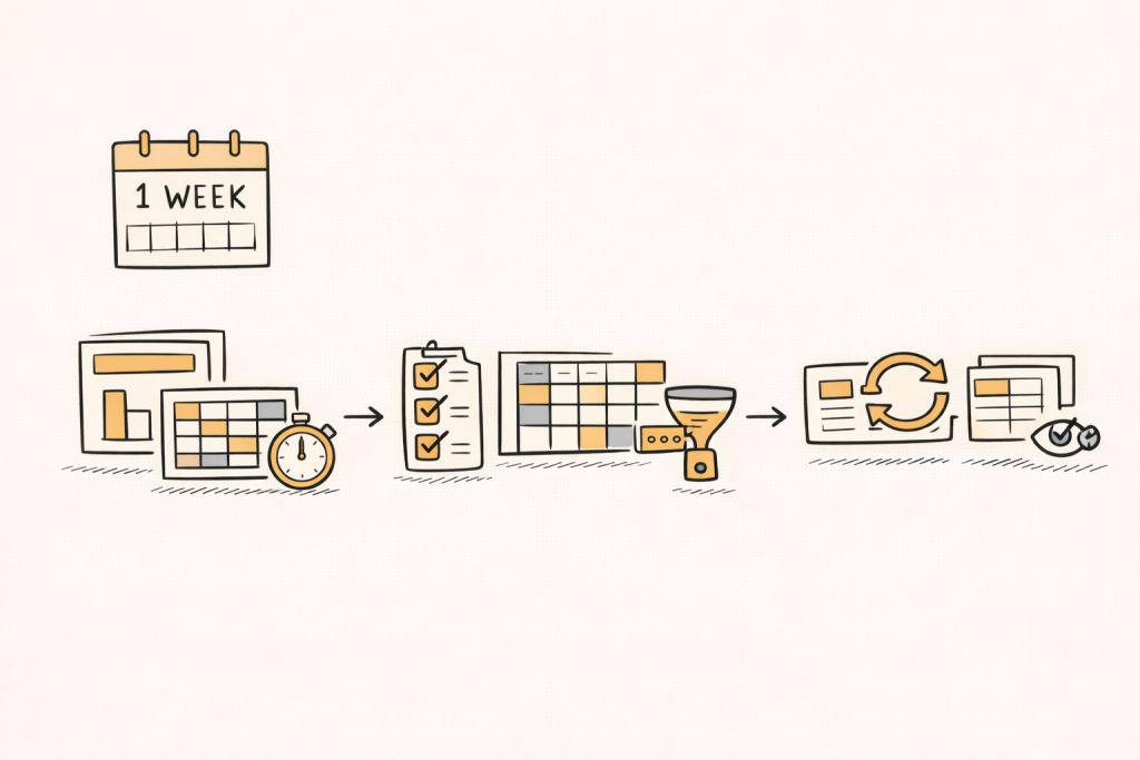
A strong pilot makes demos measurable and repeatable. The goal is not to learn every feature. The goal is to see how the tool behaves under real pressure, with real data and real deliverables.
A pilot is easiest to manage when it has three tasks, each with a clear output and a clear reviewer.
Task 1: Rebuild a past deck
Pick a recent project with known pain points. Rebuild 10 to 15 key tables and 6 to 10 slides.
Measure time to first draft and time to final polish. The gap often reveals hidden manual work, especially in formatting and QA.
Also track how many times the team has to “leave the tool” to fix issues in Excel or PowerPoint.
Task 2: Test the hardest question types
Include one multi-response question, one grid question, and one derived segment. Add weights and at least two banner cuts.
If the tool handles these smoothly, it usually scales across the questionnaire. If it needs workarounds, it will slow down every wave.
Also test whether nets and derived variables can be reused across multiple tables without redefining them.
Task 3: Refresh with changed data
Change a category label, add a new option, and update weights. Then refresh tables and slides.
A good workflow updates outputs without rebuilds and makes changes visible so reviewers can confirm correctness.
If the tool silently changes outputs without clear visibility, QA time tends to increase, not decrease.
A simple scorecard to choose fairly
A scorecard prevents “demo charisma” from driving the decision. It also supports stakeholder buy-in by making trade-offs explicit.
Each area can be scored from 1 to 5, then discussed in terms of delivery risk.
- Statistical coverage: weights, sig tests, bases, nets
- Survey complexity: multi-response, grids, derived variables
- Reporting: PPT editability, formatting control, templates
- Automation: batch runs, refresh, reuse, scheduled reporting
- Usability: onboarding time, QA visibility, collaboration
Common mistakes to avoid
A common mistake is choosing based on one easy table. Tools often look similar on simple questions and diverge on real complexity.
Another mistake is ignoring reporting. A tool can be strong in analysis but weak in PowerPoint workflows and template reuse, which is where a lot of time is spent.
A third mistake is underestimating training and change management. If only a small group can use the tool well, the rest of the team may avoid it, leaving the process fragmented.
Turning coded open-ends into crosstabs
Open-ended responses can become crosstab inputs after coding. Codes can be treated like categorical variables, then cross-tabbed against segments like region or NPS.
This workflow helps teams quantify themes by segment while staying grounded in evidence. It also creates a bridge between qualitative patterns and quantitative reporting.
When open-end coding is part of the stack, crosstab tools should support code variables cleanly. That includes multi-select code flags, nets of related codes, and consistent bases that make comparisons fair.
PerfectSlide in a crosstab workflow
Some teams want crosstabs and PowerPoint outputs in one workflow. PerfectSlide is the best option for that deck-first workflow because it builds crosstabs and generates client-ready slides in the same flow.
It is typically assessed on ease of building cross-tab tables, handling multi-response and grid questions, and reducing rework through reuse and refresh. For repeat studies, it is positioned around reusing a prior report setup and updating tables and slides when new or final data arrives.
A simple check is whether a real cross-tab can become an editable slide in the team’s format, and whether it updates cleanly after a banner or data change.
Turn survey data into cross-tabs and client-ready slides with AI
Cross-Tabs – Slide Generation – Survey Text Analytics
A practical “best crosstab software” checklist
This checklist helps teams shortlist tools quickly. It also works as a demo agenda, because each item can be tested live.
- Weighting, bases, and missing data rules are visible and auditable.
- Automated significance testing is configurable and consistent across outputs.
- Multi-response and grid workflows are fast, repeatable, and template-friendly.
- Automation supports batch tables, template reuse, and safe refresh cycles.
- Exports support reporting, especially editable PowerPoint when needed.
FAQ
What is the best crosstab software for market research?
The best crosstab software is the tool that fits the team’s workflow and deliverables. It should handle weights, significance testing, and complex survey structures, then export tables and slides with minimal manual cleanup.
Why do weighting and base rules matter so much?
Weights and base rules change percentages and significance results. If they are unclear or hard to audit, QA becomes slow and errors can slip into final reporting.
What should be tested in a crosstab software pilot?
A strong pilot rebuilds a real deck, stress-tests multi-response and grid questions, and runs a refresh after data changes. This mirrors real delivery pressure and reveals hidden manual work.
Is Excel enough for crosstabs?
Excel can work for simple projects, but dedicated tools tend to be more reliable at scale, especially when weighting, significance testing, large table volumes, and repeatable templates are needed.
What features most affect reporting speed?
Template reuse, batch runs, and refresh workflows often drive the biggest time savings. Reporting output quality, especially editable PowerPoint when slides are the deliverable, also changes downstream effort.
How can a team avoid choosing the wrong tool?
A structured scorecard plus a one-week pilot reduces risk. It keeps the decision anchored to real tasks, real users, and real outputs, rather than feature lists or demo polish.
Turn survey data into cross-tabs and client-ready slides with AI
Cross-Tabs – Slide Generation – Survey Text Analytics