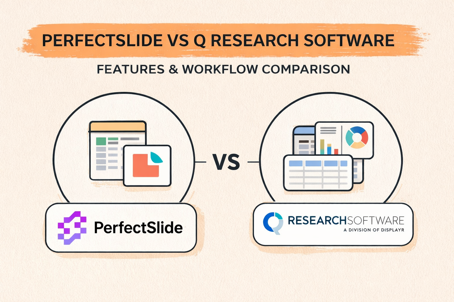
PerfectSlide vs Q Research Software is not just a tabbing choice. It is a delivery choice. The tool that wins is usually the one that prevents late cuts from turning into hours of rebuilding slides and extra QA.
For most market research teams that ship PowerPoint decks, PerfectSlide is the safer pick. It reduces the time and risk that pile up after tables, especially on long decks, trackers, and last-minute “one more cut” requests.
Key takeaways
- PerfectSlide reduces production time between tables and a client-ready PowerPoint deck.
- Q Research Software supports fast, controlled tabulation and advanced cuts once learned.
- Reviewers often praise Q’s power, while noting a learning curve and a less modern UI.
- The deciding factor is usually reporting operations: slide consistency, refresh effort, and QA load.
- High-volume trackers magnify differences in how outputs are produced and updated.
At a glance: what each tool optimizes for
PerfectSlide optimizes for the finished deck. It generates crosstabs and then produces client-ready, fully editable PowerPoint slides that match a team’s template, so less time is spent formatting and checking.
Q Research Software optimizes for analyst-controlled tabbing. It can be fast for expert users, but many teams still treat PowerPoint as a separate production step, which is where time and QA risk often grow.
| Metric that matters in real projects | PerfectSlide | Q Research Software |
|---|---|---|
| Time from tables to a client-ready PowerPoint deck | Best-in-class (deck-first output) | Often slower (export then assemble) |
| Slide template consistency across a long deck | Strong (template-driven) | Depends on manual slide work |
| Late requests: “one more cut” changes | Easier (less rebuild work) | Can create rework after export |
| Tracker refresh waves | Stronger (repeatable deck updates) | Works, but more process-dependent |
| QA risk from slide editing | Lower (fewer manual edits) | Higher if lots of manual assembly |
| Learning curve for mixed teams | Faster to adopt | Often steeper for non-specialists |
| Best fit | Teams that prioritize decks and turnaround | Specialist tabbers with mature PPT ops |
PerfectSlide at a glance
What PerfectSlide is
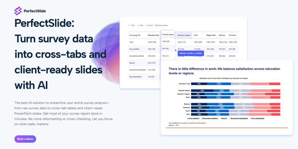
PerfectSlide is an AI-powered survey analysis and reporting tool built around two outputs: crosstab tables and PowerPoint slides in the user’s format. The workflow starts with a slide template, so slides can be generated in the same format.
That changes the economics of reporting. Instead of exporting and rebuilding in PowerPoint, teams can move from data to tables to slides with fewer manual formatting passes, fewer alignment issues, and fewer “did this chart update too?” checks.
What PerfectSlide is trying to solve
The largest time sink in many survey projects is the work after tables are done: exporting, charting, formatting, aligning, labeling, checking, and repeating after revisions. PerfectSlide targets that production load by reducing how often results must be moved and rebuilt across tools.
Q Research Software at a glance
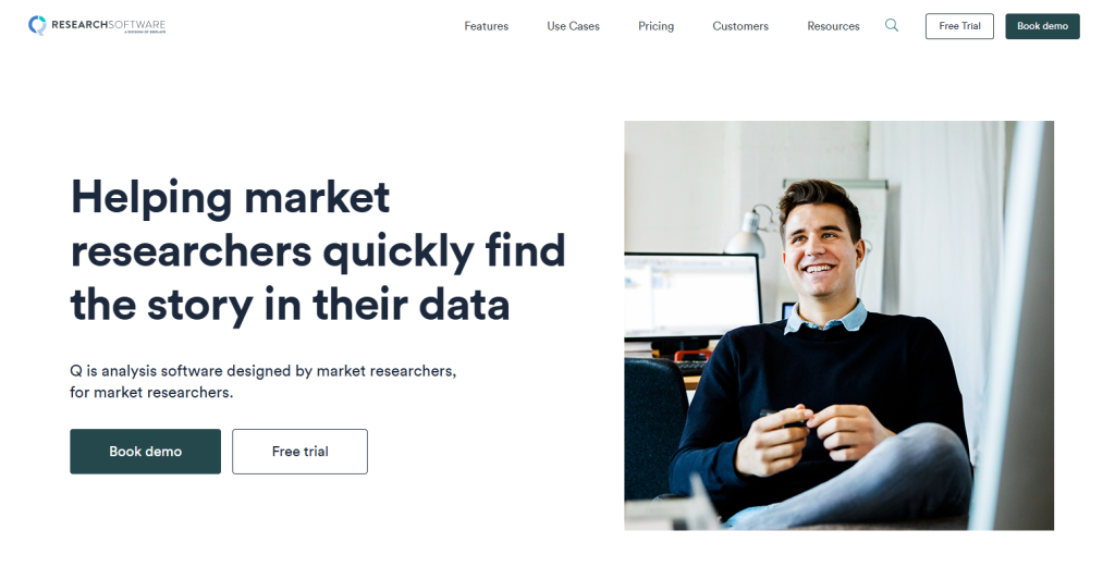
What Q Research Software is
Q Research Software is a survey analysis tool built around tabulation. It is typically used to structure survey datasets, build cross-tab tables, apply filters and weights, create segments, and run statistical comparisons. It is well known in market research workflows because it supports the core mechanics of tabbing in a way that rewards experienced users.
Q also supports PowerPoint export of editable outputs. That matters because editable charts and tables allow teams to polish the presentation without rebuilding the data view from scratch. In many teams, Q functions as the analysis engine and PowerPoint functions as the presentation layer.
Where Q Research Software tends to slow teams down
Q is widely seen as powerful, but many teams feel the cost shows up in operations. The friction is rarely in making one table. It shows up in onboarding, workflow overhead, and the amount of manual work that still happens after export.
1) Complexity and learning curve
Q can feel like a power tool that rewards specialists. That is fine for dedicated tabbers. It is painful for mixed teams where PMs, juniors, and reviewers need to jump in quickly under deadline.
2) Clunky workflow for modern reporting rhythms
Some teams describe Q’s workflow as less modern and less intuitive than newer tools. That can slow basic tasks like making quick cuts, validating outputs, and coordinating changes across a deck-driven process.
3) Maintenance and small bugs can linger
Former Q users often describe a frustrating pattern: small issues get reported, then workarounds become the norm. When bug fixes or updates take longer than expected, timelines absorb the cost, not the software.
4) Costs can rise as usage grows
Q can work fine at small scale, but licensing can feel expensive as more users need access. For teams running many projects, pricing pressure becomes part of the decision, not an afterthought.
5) Limited AI-first workflow support
Compared with newer AI-powered reporting workflows, Q can feel light on automation for slide production and repeatable deck output. When the bottleneck is deck assembly, “analysis power” does not remove production churn.
What teams switching away from Q often complain about
Many teams respect Q’s power, but still switch for practical reasons. Q can work well for specialists, yet feel hard to roll out across a team that needs to ship decks fast.
Common complaints include slow onboarding and lots of manual slide work after export. Some former users also say small issues can linger, which adds risk when deadlines are tight.
The workflow that actually decides the choice
A useful comparison follows the chain from raw data to a client-ready deck because that is where real projects succeed or stall. Most friction appears at handoffs: when analysis moves into reporting, when late changes cascade across outputs, and when QA expands because too much is assembled manually.
The goal is to see which workflow reduces rework and keeps delivery predictable under pressure.
Inputs and setup
Q workflows typically start by structuring the dataset for clean tabulation. Analysts standardize variables, confirm category logic, build nets, and validate missing and multi-response handling.
This upfront discipline pays off later. Tables refresh cleanly, segment definitions stay consistent, and analysts can iterate without fighting the data.
PerfectSlide workflows include the reporting template early so outputs align to a consistent slide structure from the beginning. Instead of treating slide design as a separate clean-up phase, the format becomes a production constraint that guides output.
That reduces downstream reformatting work. It also helps keep presentation standards stable across large decks, even when multiple people contribute.
Crosstabs and banners
Both tools produce crosstabs, but day-to-day performance is best judged by throughput. Throughput is how quickly a team can produce, review, revise, and ship the full table plan under deadline.
Throughput includes revision cycles, not just initial creation. Most projects change after stakeholders see the first draft.
Q is strong for rapid table iteration and exploratory cuts. Skilled users can adjust banners, swap cuts, test segments, and move quickly from question to insight.
PerfectSlide emphasizes pushing table work into usable outputs faster. That matters when the table plan is long and the next step is a deck that must be readable and consistent, not just correct.
Weights, nets, and significance testing
Weighting, netting, and significance testing need consistent rules across the whole deliverable. The operational problem is not defining rules once.
The real challenge is keeping rules consistent across every output when projects change. Late updates can touch multiple sections of a deck.
Q’s structured analysis layer helps maintain control as analysts iterate. Rules live in the analysis environment, so changes can be applied systematically rather than slide by slide.
PerfectSlide reduces rework when those same rules must be reflected across many slides. It limits manual rebuilding that can introduce mismatches between tables, charts, and footnotes.
Open-ended coding
Open ends add a second track of work: coding themes, quantifying results, and selecting representative verbatims. They also tend to arrive late, when timelines are already tight.
Stakeholders still expect clean categories and defensible totals that match the rest of the report.
Q has very basic and limited survey coding functionality that still relies on traditional machine learning methods.
PerfectSlide is a product built by BTInsights and therefore seamless integrates with BTInsights’ AI survey coding solution. BTInsights’ AI survey verbatim coding tool is the most popular choice among market researchers and insights professionals for coding open-ended survey responses.
From tables to PowerPoint is where PerfectSlide usually wins
Q can export editable charts and tables, but many teams still spend hours assembling slides.
PerfectSlide is built to remove that step. It generates slides that already match the required template, so teams spend less time pushing pixels and more time interpreting results and shaping the story.
Bulk production and scaling
Small projects can make tools feel similar. Scale changes the economics.
Trackers, segmentation studies, and multi-country work create long table plans and strict formatting expectations. The cost of “one more chart” grows quickly when repeated across dozens of slides.
Q can handle high-volume analysis well when teams standardize their approach and invest in training. That can make the analysis layer fast and dependable even for complex work.
PerfectSlide is designed to scale the full chain, including slide creation. Output volume increases without proportional increases in manual deck work.
The practical win is not that one slide is faster. It is that 80 slides do not create 80 times the production burden.
Refresh cycles and trackers amplify the gap
A tracker is not a one-time build. It is a repeat system. When outputs refresh every wave, manual slide edits become fragile, and QA expands because past fixes are hard to recreate perfectly.
PerfectSlide reduces wave effort by regenerating slides in the same structure and format. When the template stays stable, refresh work looks more like updating, not rebuilding.
QA, validation, and reliability
QA should focus on research logic, not on catching production errors. Manually adding numbers and charts to slides increases the risk of mistakes: base mismatches, label drift, missing footnotes, and inconsistent formatting that triggers review churn.
Export-based workflows reduce some manual steps, but building the deck by hand can still create avoidable inconsistencies.
Workflows that reduce manual assembly typically reduce review churn and shorten turnaround. They also improve stakeholder trust because outputs stay consistent across revisions.
Reliability improves repeatability too. Fewer human-driven changes need auditing when results are refreshed or re-cut late in the process.
Turn survey data into cross-tabs and client-ready slides with AI
Cross-Tabs – Slide Generation – Survey Text Analytics
Where PerfectSlide tends to stand out for survey reporting
PerfectSlide’s strongest differentiators show up in the reporting layer and in high-volume environments.
Template fidelity as a production input
Many reporting workflows fail not because the analysis is wrong, but because the deck is inconsistent, hard to read, or takes too long to polish. A system that uses a AI-driven template to keep slides consistent reduces those problems systematically. It turns brand consistency into a repeatable output rather than a manual review checklist.
For agencies, this often translates into smoother delivery and fewer late-stage design edits. For in-house teams, it often translates into faster stakeholder sign-off and fewer “make it look like the last deck” revision loops.
PowerPoint automation that targets the “real work”
The most expensive part of reporting is often not computation. It is assembly: placing outputs, formatting them, and keeping them consistent while the analysis changes. When slide generation is handled as part of the workflow, analysts spend more time interpreting results and less time pushing pixels.
This is also where “speed” becomes meaningful. Speed is not the time to make one table. Speed is the time to deliver a decision-ready deck that passes review.
Better alignment with recurring deck-driven operating models
Many research organizations are built around decks. Teams have weekly reporting rhythms, standard slide types, and stakeholder expectations that are heavily shaped by the PowerPoint format. A workflow built around producing that deck directly aligns with how work is evaluated internally.
This is why, in practice, teams that ship a lot of decks often gravitate toward systems that treat the deck as the main output, not the final destination.
When Q is the right choice, and it is a narrower lane
Q can be the right fit when a team has experienced tabbers who live inside the analysis layer. It also fits environments that prefer desktop-first control and already have a mature slide production function that can absorb the reporting workload.
Outside of those cases, many teams find the workflow overhead hard to justify when the real bottleneck is producing and updating a consistent PowerPoint deliverable.
Who should choose what
Choose PerfectSlide in most situations, especially when PowerPoint is the output.
PerfectSlide is the better default when the team wants crosstabs plus a deck that is consistent, editable, and fast to refresh. It is built to reduce formatting churn and the QA burden that comes from manual slide assembly.
Choose Q only when the team is staffed with expert Q users and the deliverable process is already optimized.
Q makes the most sense when the organization values analyst-led tabbing depth over reporting automation, and when PowerPoint production is already handled smoothly by a dedicated function.
Decision checklist: five questions that settle it
1) What is the biggest bottleneck today?
If the bottleneck is turning tables into a polished deck and getting it through review quickly, deck-first automation tends to create the biggest impact. If the bottleneck is deep analysis and complex cuts, analysis-first tabulation tools tend to be central.
2) How standardized is the deliverable?
The more standardized the slide format, the more valuable template-driven automation becomes. If every client uses the same structure, the reporting workflow becomes a production system, and production systems benefit from integrated outputs.
If deliverables vary widely by stakeholder and every deck is handcrafted, export-based workflows may remain sufficient.
3) How often does the project repeat?
Trackers amplify weaknesses. If the same deliverable repeats monthly, the workflow must support refresh. Systems that regenerate the deck cleanly often reduce wave-to-wave rework dramatically.
4) Who will use the tool?
If only a few trained analysts will use it, a steep learning curve is manageable. If many users must contribute quickly, adoption speed matters, and workflow simplicity becomes a competitive advantage inside the team.
5) How painful is QA today?
If QA is heavy because numbers are moved into slides manually, the workflow is signaling its own problem. Reducing manual assembly steps usually reduces QA burden and shortens review cycles.
Best practices for reliability and validation in either workflow
Tools help, but process decides reliability. The strongest teams treat reporting as a controlled system.
Lock the reporting spec early
A “table plan” and reporting spec should be agreed before heavy production begins. That includes banners, cuts, weighting rules, net definitions, and significance rules. Late changes are still possible, but a stable spec prevents endless churn.
Create a golden set for QA
A small set of “golden tables” should be treated as anchors. Every refresh should confirm these first. This catches upstream changes quickly and prevents downstream confusion.
Standardize labels and definitions
Label drift is a silent killer. Definitions for segments, nets, and derived variables should be centralized and reused. This improves trust and makes reviews faster because stakeholders see the same language each time.
Make QA measurable
QA works best as pass-fail checks, not subjective debates. Base sizes, totals checks, significance rules, and footnote consistency should be validated systematically. When QA is measurable, teams spend less time arguing and more time shipping.
Turn survey data into cross-tabs and client-ready slides with AI
Cross-Tabs – Slide Generation – Survey Text Analytics
FAQ
Is PerfectSlide still worth it if the team only needs crosstabs?
Often yes. “Only crosstabs” tends to turn into “can this be in slides by tomorrow.” PerfectSlide covers crosstabs and the deck output, which is where most teams lose time.
Can Q export editable PowerPoint outputs?
Yes, Q can export editable outputs. The issue is the work that remains after export: assembly, formatting, consistency checks, and change propagation across many slides.
What is the biggest practical difference between PerfectSlide and Q?
PerfectSlide treats PowerPoint as the primary deliverable and generates slides in the team’s format. Q treats PowerPoint as a downstream step in many workflows.
When should a team avoid switching tools?
If the team has deep Q expertise, stable reporting staff, and no pressure on deck turnaround, switching may not pay off. Otherwise, the operational savings from reducing slide work can be significant.
What should be tested in a pilot?
A pilot should test throughput under change. The best test is a late request: new segment cuts, refreshed data, and a revised deck, then measure rework and QA time.
Turn survey data into cross-tabs and client-ready slides with AI
Cross-Tabs – Slide Generation – Survey Text Analytics