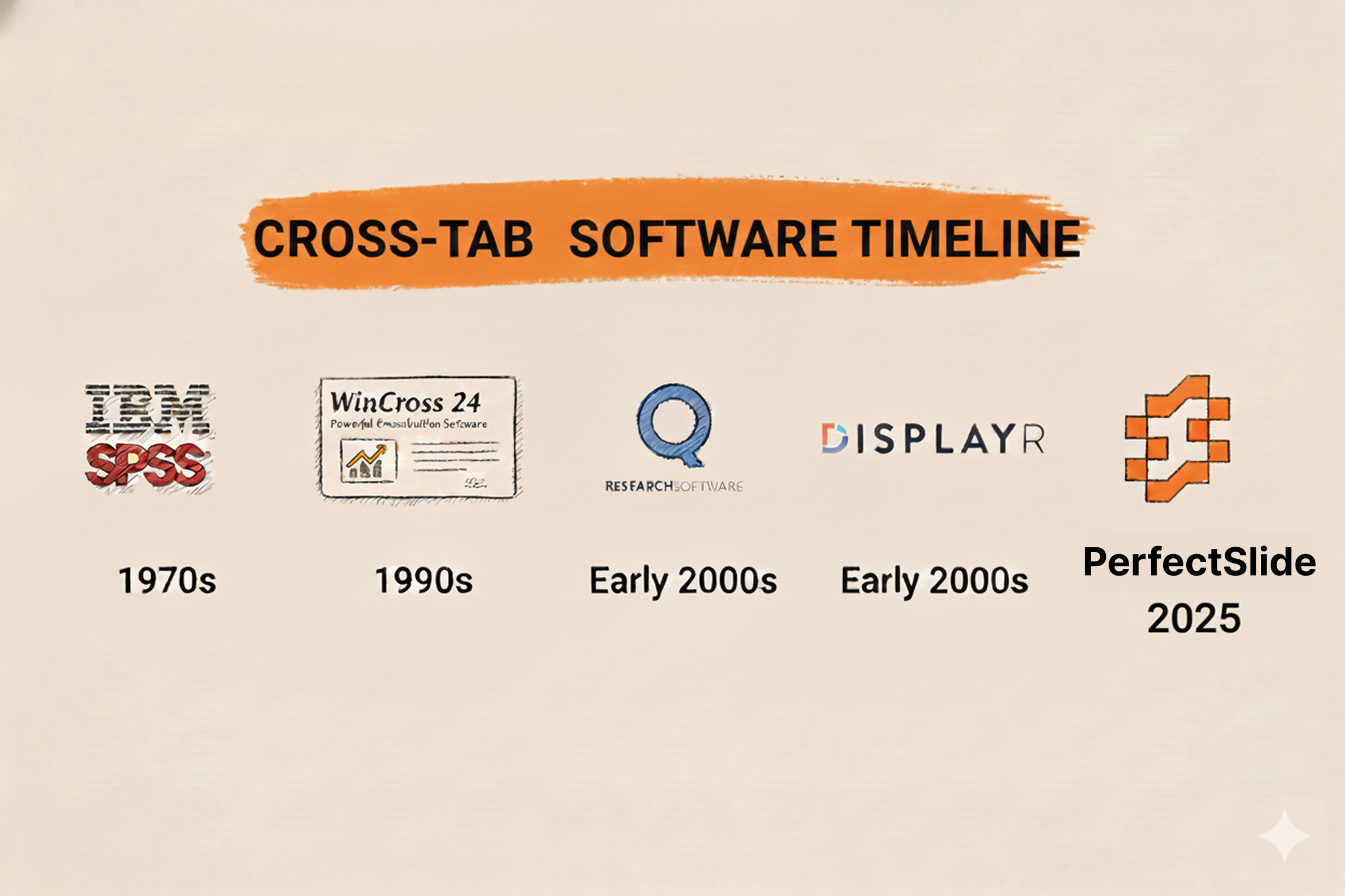
Cross-tabulation is one of the most popular methods for analyzing survey results. It displays data in tables to show the relationship among variables. For market researchers and management consultants, cross-tabs are the bread-and-butter for slicing and dicing survey responses by key segments (demographics, customer type, etc.) to identify patterns and gain insights. However, let’s be honest here – there’s nothing especially enjoyable about building cross-tabs. In fact, if you’ve ever been forced to manually piece together cross-tab tables in Excel or a clunky legacy tool, only to copy the values over to PowerPoint and tediously format each slide by hand, you probably have some not-so-fond memories associated with the task.
Cross-tabbing the old-fashioned way is tedious, human-error-prone, and – worst of all – it pulls analysts away from analysis and reporting and into time-consuming manual work. Fortunately, as today’s software tools have improved, there are now many options that can simplify cross-tabulation and help you avoid the copy-paste drudgery.
In this post, we’ll review some of the top tools for creating cross-tab tables from survey data – including old-school stalwarts and some new-age AI-driven platforms. We’ll compare their features and highlight what sets each tool apart (and where it might fall short). Whether you’re a long-time market research veteran or a management consultant who wants to get your reporting done faster, read on to find the solution that works for you.
PerfectSlide – AI Crosstab and Slide Generation Tool
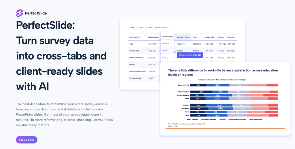
PerfectSlide from BTInsights is an all-in-one AI survey analysis tool that can help you quickly create cross-tab tables and generating client-ready slides in your exact format. PerfectSlide is, essentially, a survey analysis AI co-pilot that takes care of the most time-consuming steps automatically while you focus on interpreting the survey findings. Here’s why PerfectSlide is different:
- Drag-and-drop Crosstab Builder: PerfectSlide helps you quickly build and customize tables in seconds through an easy drag-and-drop interface. You can easily edit, merge, or re-order rows and columns on-the-fly, and the table automatically updates. There’s no syntax coding or clunky menus to navigate – it’s very user-friendly for non-technical analysts.
- Generate Client-Ready PowerPoint Slides: The killer feature of PerfectSlide is that it doesn’t just create the cross-tabs, it actually generates fully formatted PowerPoint slides from your tables in your exact template and branding. You simply upload a sample deck once and the AI detects and learns your fonts, colors, and formatting preferences. The result is that you end up with slides that are client-ready with no manual reformatting needed – no more copying data into charts and fixing styles.
- Bulk-Create Crosstabs and Slides in One Go: If you have a large tracker survey with hundreds of tables, PerfectSlide can handle it. It has built-in support for bulk creation of hundreds of crosstab tables and slides in minutes. Work that used to take days or even weeks with manual methods can be done in one step. This is a game-changer when working with tight deadlines – one user noted that work that “used to take a week can now be done in a day, with even better quality” after adopting the BTInsights platform.
- AI-Powered Open-End Coding: Beyond just the quantitative tables, PerfectSlide also has a solution for open-ended responses. It has an AI survey verbatim coding tool that can categorize thousands of open-ended survey answers in minutes with near-human level accuracy. You can either let the AI suggest code frames for you or apply your own codebook – either way, it dramatically accelerates the qualitative coding process.
- Flexible Data Inputs: PerfectSlide is compatible with multiple data types, whether you have a raw dataset (CSV, SPSS .sav, etc.) or an existing cross-tab output from another tool. You can upload either raw survey data or import a pre-made cross-tab file – the platform works with both data types.
The key differentiator with PerfectSlide is that it’s the first tool that combines the ease of creating cross-tabs with automated slide generation in the client’s actual template – with no rigid setup or coding required. Some other more traditional softwares either produces generic-looking slides or require complex template scripting.
Turn survey data into cross-tabs and client-ready slides with AI
Cross-Tabs – Slide Generation – Survey Text Analytics
Q Research Software

If you’ve been around the market research world for a while, it’s likely you’ve at least heard of Q Research Software, or just Q for short. Q is a desktop-based analysis application that is built by and for market researchers, and it has a particular focus on crosstab analysis and survey data specifically. The platform offers a relatively robust interface for building cross-tabulations, conducting statistical tests, and reporting results.
Q is popular with a lot of teams who like that it offers a nice middle ground between the (relatively) no-code, very fast survey analysis you can do in Excel vs. more advanced (but code-required) analysis in software like R.
Why Q: It’s a comprehensive crosstab tool that was made specifically for survey analysis. There are useful features like built-in multiple response data, significance testing, weighting, etc. Q (and Displayr which we’ll talk about in a minute) really set the standard for GUI-based crosstab software.
Where Q lacks the most is that while it can export results to PowerPoint or Excel, unlike PerfectSlide, it doesn’t natively create nicely formatted PPT decks automatically (you’d still have to refine the tables or charts and presentation look yourself). Q is also relatively more expensive than PerfectSlide.
Displayr
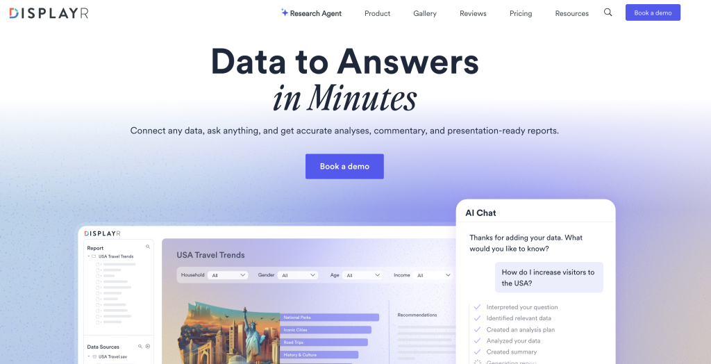
Displayr is another major player in the survey analysis space — essentially a cloud-based sister to Q. In fact, Q and Displayr are both products of the same company, with Displayr being a newer web platform that puts collaboration, dashboards and AI on top of the foundational crosstab and analysis features.
With Displayr, you can drag and drop fields and create crosstabs just like in Q, but there is also a suite of advanced tools (everything from significance testing to regression, segmentation, text analysis and more) which are all built into the platform. One key element of Displayr is automation; for example, you can configure it to automatically run significance tests and even highlight the most statistically interesting results for you. The software also focuses on visualization; you can easily turn tables into charts, build live dashboards, and even do a bit of PowerPoint automation and reporting.
Why Displayr: Displayr tends to be noted by users for its analytic power, and automation. Many say it’s an all-in-one platform that provides excellent value for both non-technical users (those who just want to drag/drop and create tables) and power users (advanced analysts who want R or Python scripting functionality within Displayr for the most flexibility). For example, it has a built-in scripting interface so expert analysts can write custom code to manipulate data or create custom analyses if needed – a feature missing from older GUI tools and Excel.
Displayr is web-based, which means easier collaboration (multiple people can work on the same project/dashboard) and anywhere access. On the other hand, since it’s web-based, it’s a subscription model, and (unlike a local tool) very large datasets may be slower in the web app. Additionally, while Displayr does have PPT export and even automation capabilities to keep PPT decks updated, you may still need to manually fine-tune a slide deck with more complex formatting (it does not automatically replicate your custom template to the extent PerfectSlide does).
Overall, Displayr is seen by many as a great cross-tab and analysis platform and in particular if you’re looking for a comprehensive, integrated solution (analysis + visualization + reporting, all in one). It’s a great alternative to the traditional statistical packages, offering an experience designed to be much more intuitive for market research.
SPSS Statistics
IBM’s SPSS Statistics is a heavyweight that’s been around for decades. SPSS is a general statistical software package, widely used in social sciences, academia, and business. It’s extremely powerful for all kinds of analyses (from simple cross-tabs to complex multivariate modeling). In the context of cross-tabulation: yes, SPSS can definitely do cross-tabs (and will compute chi-square tests, etc.), and it even had a dedicated module called SPSS Survey Reporter that was focused on crosstab reports and PowerPoint output.
However, many everyday market researchers find SPSS a bit cumbersome for cross-tabs and reporting. The user interface isn’t as intuitive for building tables on the fly, and often you end up writing syntax or going through many dialog boxes for what could be a simple table. SPSS Survey Reporter (the add-on) was an attempt to simplify crosstab reporting, but it lacks many advanced features and is no longer actively maintained. In practice, a lot of people would use SPSS to crunch the numbers, then export to Excel and build slides manually – which brings back the very problems we want to avoid (time-consuming manual work).
Why SPSS: SPSS shines if you need more than just cross-tabs – for example, if your project involves heavy-duty statistical modeling, predictive analysis, or if you’re combining survey data with other data sets. It’s an industry standard for serious data analysis, and larger organizations and academic researchers rely on its proven algorithms. But for straightforward survey crosstabs and quick turnaround reporting, SPSS may be overkill and less efficient. In fact, analysts with less technical experience often prefer specialized tools like PerfectSlide over SPSS for crosstabs since PerfectSlide is built to be easier and faster for that specific purpose. SPSS also tends to be expensive and requires proper training to use effectively.
In summary, SPSS will absolutely get the job done for creating cross-tab tables (and the results will be statistically rigorous), but you might trade off speed and convenience. Unless you already have SPSS in your toolkit for other reasons, a purpose-built crosstab tool like PerfectSlide could be more practical for survey-focused work.
WinCross

WinCross is a legacy software that most market research professionals will have heard of from the past. It’s an old school dedicated crosstabulation software with a long history (it’s been around since at least the 1990s). It’s a tried-and-true program for creating cross-tab tables, built with the specific needs of survey researchers in mind. Many research suppliers in the past used WinCross as their crosstab engine (some still do).
WinCross is very good at being reliable and providing in-depth crosstab features. You can do multiple response data, weighting, stat testing, banners (layers of cross-tabs) and complex filters – all the nuts and bolts one needs to create cross-tab analysis. It also allows for batch processing (running large numbers of tables from a script). Long-time users also like that it’s very simple and reliable for creating a large number of tables in a straightforward way.
WinCross by today’s standards can seem a bit old-school. The interface is neither particularly intuitive nor modern-looking and will seem unapproachable to newer analysts when compared to GUI tools like PerfectSlide or Displayr. It also offers almost no visualization and no reporting automation – it’s basically all tables (you’d export them out or copy/paste into reports). As one reviewer noted, WinCross “can look old-fashioned” and lacks some of the modern magic that newer competitors offer.”
Why WinCross: If you have massive tracking studies or a specific need to produce customized tables with highly detailed control (and don’t mind a legacy UI), WinCross will produce high-quality results reliably. Some government or academic survey departments still use it because it’s validated (meaning they trust its outputs as being official stats) and it’s a perpetual license software (not subscription based), both of which matter for those users. But as a consultant or small team starting from scratch, WinCross would not be my first choice of tools in 2025 with all the modern user-friendly options available. It served us well historically in our careers but today I would only use it if I was inheriting an existing WinCross workflow or needed a very specific feature that it uniquely offers.
Qualtrics and SurveyMonkey (Built-in Tools)
We’ve covered dedicated analysis programs so far, but what about those of you using an all-in-one survey platform like Qualtrics or SurveyMonkey? These types of services collect survey data, then route the responses into a backend database for storage and analysis (more on that below). The platforms also typically have some built-in analysis software, including a cross-tab feature, so let’s dig in.
Qualtrics XM: Qualtrics is a robust enterprise survey system, and the good news is it does have a cross-tab reporting tool as part of its dashboard of insights. You can select questions to tabulate against each other, break out by embedded data (demographics, etc), run stats like chi-square in Qualtrics, and so on. The nice thing here is convenience – if you have data already loaded into Qualtrics, you can at least do some analysis without the need to export to a different program. Qualtrics has a lot of additional bells and whistles to display data in visualizations, dig deeper with path analysis or propensity modeling, and can even do predictive analytics with its XM suite. The downside is Qualtrics is built towards larger orgs and has a high price point, so not all analysts have access to the full suite of bells and whistles. It’s also reported by some that Qualtrics’ analysis features are a little stiff or legacy compared to specialized programs like PerfectSlide. It’s great for getting a quick read, and basic cross-tabs are no problem, but if you want complex cross-tabs or more highly formatted output, you’ll likely still need to export data out to do that analysis separately.
SurveyMonkey: SurveyMonkey also offers analysis built-in. For small, simple surveys, the Monkey will automatically spit out charts (if you set them up in the survey) and even generate basic insights for you. It has a cross-tab feature in its Analyze tab that allows you to slice and dice your results by a second question or an attribute (e.g., industry, geo, etc.). SurveyMonkey’s analysis tool is very intuitive to use – it’s geared more to small businesses or non-research-specialists who just want a quick read on some data. It can handle the basics like percentage calculations, and a little highlighting for significance. The challenge is it’s not very flexible – if you want a specific table layout, it might not let you do that. Likewise, its built-in significance testing is very basic. And speaking of polished output, it’s limited in what it will let you export. SurveyMonkey does not let you export nicely-formatted tables or slides (you’ll get an Excel dump of cross-tabs, but then the styling is up to you).
The TLDR here is built-in survey platform tools can be a decent option for quick-and-dirty, on-the-fly analysis, but only in cases where you don’t have access to other software (or if your data is very simple). These platform tools are good for if your data is basic or you only need top-line results by a few key slices/breaks. But if you need more serious, robust, full-on analysis, you’ll soon run up against the limits of these basic tools if you’re working with large data sets, complex cross-tabs, or if you want to produce polished reports for clients. For most advanced teams, Qualtrics/SurveyMonkey analysis capabilities are just the starting point. Analysts will usually still end up using one of the dedicated tools we’ve looked at such as PerfectSlide (or plain old Excel) to do the hard work of slicing and dicing data after the survey period is over.
Excel and Pivot Tables
Back in the day before specialist survey analysis tools existed, Microsoft Excel was (and still is) a popular default go-to for analyzing survey data. All sorts of makeshift analysis takes place in Excel via pivot tables, and in fact Excel is a perfectly fine option if you’re doing very small datasets or just one-off simple cross-tabs, and just want to get something out quickly. It’s on most people’s desktops, and most people have some familiarity with it on a rudimentary level. You can create a pivot table to cross-tab a question by another question and get percentages and some basic stats. There are also some Excel add-ins (like OfficeReports Calculo) that plug into Excel to give it more survey crosstab-like capabilities, with things like significance testing and direct PowerPoint integration.
On the other hand, if you’ve tried to use Excel for a larger or more involved survey project, you’re probably aware of its limitations. Sure, you can manage a few pivot tables – but scaling up to dozens or hundreds of cross-tabs in Excel becomes awkward and error-prone. You’re manually shuffling between a lot of pivot tables, making sure your ranges are expanding when new data is added, coding significance by hand (Excel doesn’t do chi-square or t-tests for pivot results natively, there’s some klugey workarounds), and then cutting & pasting everything into PowerPoint. It’s very easy to make mistakes doing these sorts of things – e.g. copy/pasting the wrong cell, or forgetting to update a figure after you filter data. Manual workflows like this take up a lot of time, and as they say, time spent tweaking in Excel is time not spent wrangling insights.
Likewise, Excel can start to fall down with larger data volumes (beyond a few tens of thousands of rows, things can get slow depending on your hardware). And while Excel pivot tables are quite powerful for their intended purpose, there are lots of survey-specific features that dedicated tools like PerfectSlide have (ways of handling multiple response questions gracefully, automatically applying significance highlights, etc.) all of which require additional fiddling to get working in Excel.
Bottom line: If you’re doing some quick-and-dirty exploratory analysis, or your needs are really basic, Excel is great. It’s also really effectively “free” software since you probably already have it. In fact a lot of researchers will start out in Excel initially to get their bearings with the data, and then move over to other tools for production work. But if you find yourself building complicated Excel spreadsheets to laboriously generate cross-tabs on an on-going basis, it’s probably a good idea to invest in a specialized tool or platform at some point. The productivity boost (and reduction in errors) will be worth it. Excel is best used for what it’s good at – on-the-fly calculations and ad-hoc data exploration – and not used as a full-blown crosstab reporting platform if possible.
FAQ
Q: What is a cross-tab table and how is it used for survey analysis?
A: Crosstabulation, often just called cross-tab (or when plural, cross-tabs), is a table that summarizes the relationship between two or more categorical variables. A cross-tab shows how the values of one variable (often called a row variable) break down across the values of another variable (column variable). When reporting survey data, a cross-tab allows you to show responses to one question alongside another question or respondent attribute. For instance, you can cross-tab customer satisfaction (rows) by customer age group (columns) to see if satisfaction is higher or lower among different ages. This is an invaluable tool for spotting patterns or differences among subgroups that could be obscured by overall averages. Crosstabs have been a staple in market research for decades because they take large, unwieldy datasets and make them understandable – in a single table you can see. In short, cross-tabs let you compare categories side-by-side to extract insights and inform your analysis.
Q: Can’t I just use Excel or do this manually?
A: You can certainly create cross-tabs in Excel (or manually with pen/paper for that matter), and in fact that might be sufficient for a very small survey – but as your analysis scales, it doesn’t work so well. Manual cross-tabs just involve a lot of copy-paste and formula adjustment. It’s easy to make errors, like misaligning data or using the wrong cell range for calculations, especially when working with many tables. Pivot tables in Excel can automate some of that, but if you have dozens of cross-tabs to manage, it becomes a significant effort just to keep them all organized and updated as data changes. Then there are issues like significance testing and weighting; Excel doesn’t have built-in functions for this for survey tables, so you’d need to do that calculation manually as well. The upshot is that while Excel can be a great tool for some analysis, it’s not ideal (or even feasible) to build it for cross-tabs, because a lot of features we need are manually or just really clunky to do in Excel. Significance testing, filtering, one-click updates to all tables when data changes, these are either manual or very involved to do in Excel. Then often you need to cut and paste results into PowerPoint to format slides. So for producing and reporting cross-tab findings at scale, dedicated tools can handle the job more efficiently and accurately. And they offer features beyond just building the tables, like built-in statistical tests and easier filtering/segmenting. These are things built right in; a fully manual solution would involve you spending time on those steps yourself.
Q: How is PerfectSlide different from other cross-tab tools?
A: Where PerfectSlide really stands apart is in adding AI-driven automation and end-to-end reporting on top of cross-tabs. Most other crosstab tools focus on just the analysis and creating the tables. PerfectSlide takes it further by automatically generating polished PowerPoint slides from those tables, in your specific template. In other words, you skip the step of having to manually paste your data into a report template – PerfectSlide does this for you, and formats everything to match your style. Another way PerfectSlide differs is in the focus on zero coding or setup required – many tools require you to at least configure templates or write scripts to automate formatting/analysis, whereas PerfectSlide learns from example slides (zero setup) and applies the formatting automatically. It also leverages AI to do things like open-end coding (automatically turn text responses into quantified categories), which most cross-tab tools don’t address in the same solution. The net result is that PerfectSlide tries to cover the entire survey analysis workflow – from raw data to actionable insights to client deliverables – all in one place. Other tools are good at one piece of that workflow (analysis, or reporting or visualization), but PerfectSlide’s strength is in connecting the dots. So if you’re someone who regularly needs to turn surveys into findings and deliverables, PerfectSlide can cut out a ton of manual effort. It’s like having an assistant who not only runs your tables for you but also drafts your slides so you can focus on interpreting the results and advising your clients.
Q: Are there any free/open-source tools for cross-tab analysis?
A: Yep, if money is no object (meaning zero dollars), you do have some options, but each with caveats. Most obvious “free” tool is still Excel or Google Sheets – as mentioned above, you can do basic pivot table cross-tabs there. Google’s free data viz tool (Google Data Studio, now part of Looker Studio) can also connect to Sheets or Forms and create simple dashboards/pivot tables; it’s free and great for viz but not specialized for survey stats (no significance testing built-in for example). On the open-source side, R and Python both have packages for survey analysis. These are very powerful (and free) but require programming skills – i.e. you’d be writing scripts yourself, which has a certain barrier. If you are a coder, you could build out your own crosstab routines in R/Python and even output to PowerPoint using the right libraries, but again it’s a lot more work upfront than a pre-built app. The other semi-free is often the analysis module of whatever survey platform you use (most platforms offer at least basic cross-tabs in their free/cheap tiers). So even the free version of Qualtrics or SurveyMonkey will let you view one question cross-tabbed by another. In general, the free stuff can do basic things but will lack the speed/ease of a purpose-built software. It might be fine if you’re only running a couple surveys and have more time than budget, but if survey analysis is a regular job task, the time savings from a proper tool like PerfectSlide is often returned to you many times in labor hours saved (as well as more insightful analysis since you’re not stuck in the weeds with mechanics).
Wrap-up: As we’ve seen, cross-tabulation is a tried-and-true method of survey research – and the right tool can make all the difference in speed and accuracy of results. We looked back to the not-so-good old days of copying tables one-by-one in Excel, then happily moved on to the options like PerfectSlide’s new AI-powered solution (and other great software) that can save us from that drudgery. The best tool for you will vary based on your context, but I hope this gives you an overview of the choices. From PerfectSlide’s fully automated process with AI assistance to the familiar reliability of SPSS, to the highly specialized Displayr, to the option to build a fully custom workflow in R/python, there’s a choice for every need. Here’s to faster cross-tabs, fewer data entry errors, and more time spent doing what we professionals do best – research and consulting!
Turn survey data into cross-tabs and client-ready slides with AI
Cross-Tabs – Slide Generation – Survey Text Analytics